Industry
Finance
Client
Employer claims portal
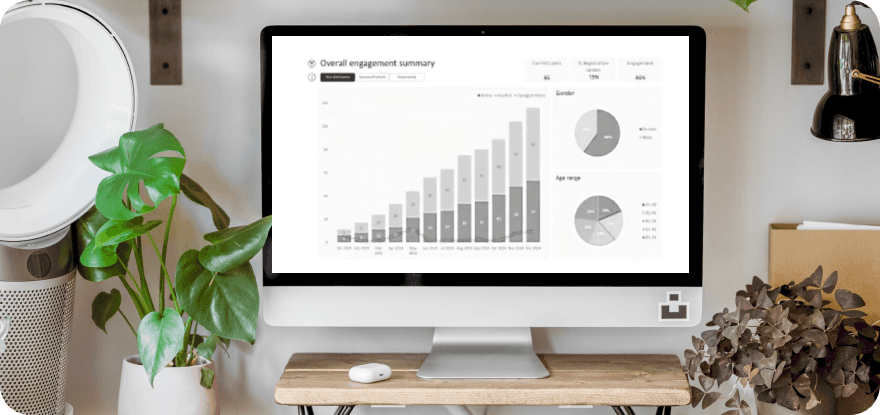
Benefits company wanted to create a new employer portal that served multiple user types across several products, but a single static homepage couldn't adapt to what each user actually needed, creating confusion, poor navigation, and missed engagement with key services. Senior UX Designer. Responsible for end-to-end UX strategy, information architecture, content modelling and wireframes across desktop and mobile. This was the organisation's first use of Kontent.ai as a headless CMS outside of digital team, educating stakeholders, product teams and engineering on how headless content architecture works in practice. Final visual UI was delivered by IT team, and several features were descoped due to engineering constraints to keep the build simple with the overhead of content being separated from the app. This was brand new venture and the portal needed a homepage that reflected what products a user owned, who they were and what they needed to do. Multiple product variants including GIP, Group Life, Critical Illness, Cash Plan, Optical and Dental with multiple roles. An existing poorly designed legacy claim journey already existed but no overall journey at all. No established headless CMS practice in this new portal, so up to me to educate. So IA was mapped out. As requirements grew, flows became cluttered and difficult to navigate. I created a flow diagram to map products, users and requirements, while identifying descoped features (orange) based on engineering and delivery constraints. Designed a dynamic homepage that adapts to user role and products owned. Defined static, filtered and dynamic content zones, creating a framework for headless content while prioritising the highest-value features within delivery constraints. A responsive homepage built on a headless component architecture in Kontent.ai, with clearly defined static and filtered content zones. Created a detailed content model documenting every component, its data requirements and its variants, a first for the internal team. Full information architecture defined across seven top-level sections with detailed user flow mapping. Desktop and mobile wireframes validated the approach before handover to the IT for UI and engineering. A personalised, product-aware homepage replacing a static one-size-fits-all experience. Wireframe and a prototype was handed over for UI and build and support given on headless implementation. Headless content modelling approach that was subsequently expanded across other features to be added later. What I would do next is deliver the descoped features in a phased roadmap. Redo the UI to match new visual ID and design system. Introduce personalisation beyond product ownership. Continue expanding the headless content model and design system across the wider portal to reduce bespoke development and improve content editor autonomy.

